Habibah restaurant
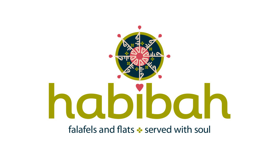
The brief: To create a brand identity for a new café/restaurant based in Cheltenham (selling authentic Palestinian falafels and flatbreads) that would capture the warmth, generosity, and character of their family-run business.
The name itself — meaning "sweetheart" in Arabic — gave a strong emotional starting point, and the brief was to create something that felt welcoming and memorable that reflected their mission “to share the love through our food; to create conversation and community.”
Logo and brand identity
The resulting identity balances a strong, distinctive logomark with warm typography and a colour palette that feels both rich and inviting. The brand works across menus, signage, and print collateral, giving the restaurant a cohesive and colourful visual presence. The tiled pattern looks equally striking on the back of a business card as it does on the restaurant wall.
If you’re in Cheltenham, and in need of some delicious, home-cooked food, check it out. You won’t be disappointed.
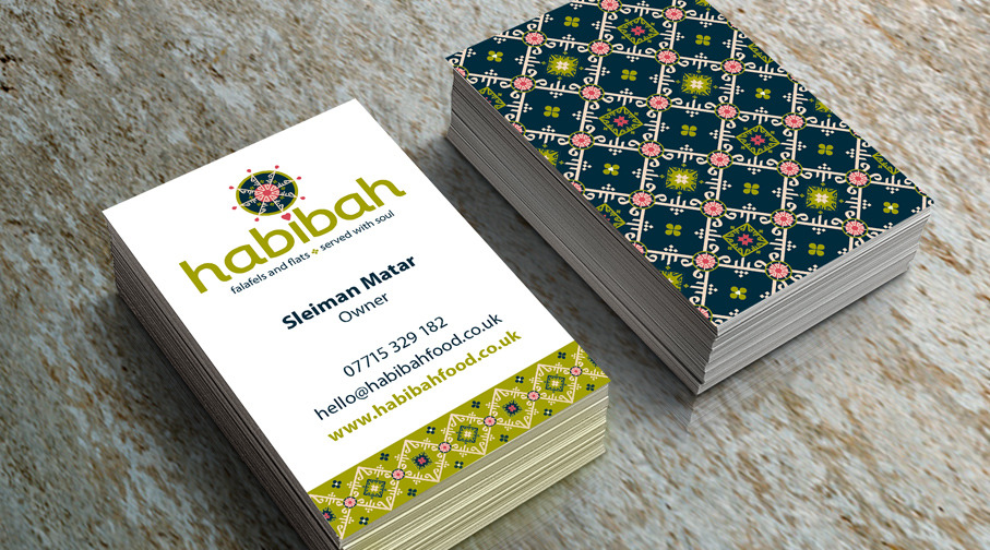
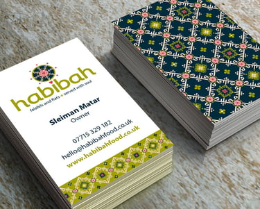
Services: logo design, pattern design, stationery, web design
"Now that the brand is complete, I realise it truly reflects my answers to the brand questionnaire I filled at the start of the project. I am already looking forward to our next design work with Ruth.”
Sleiman Matar, Habibah founder
habibahcafe.co.uk
